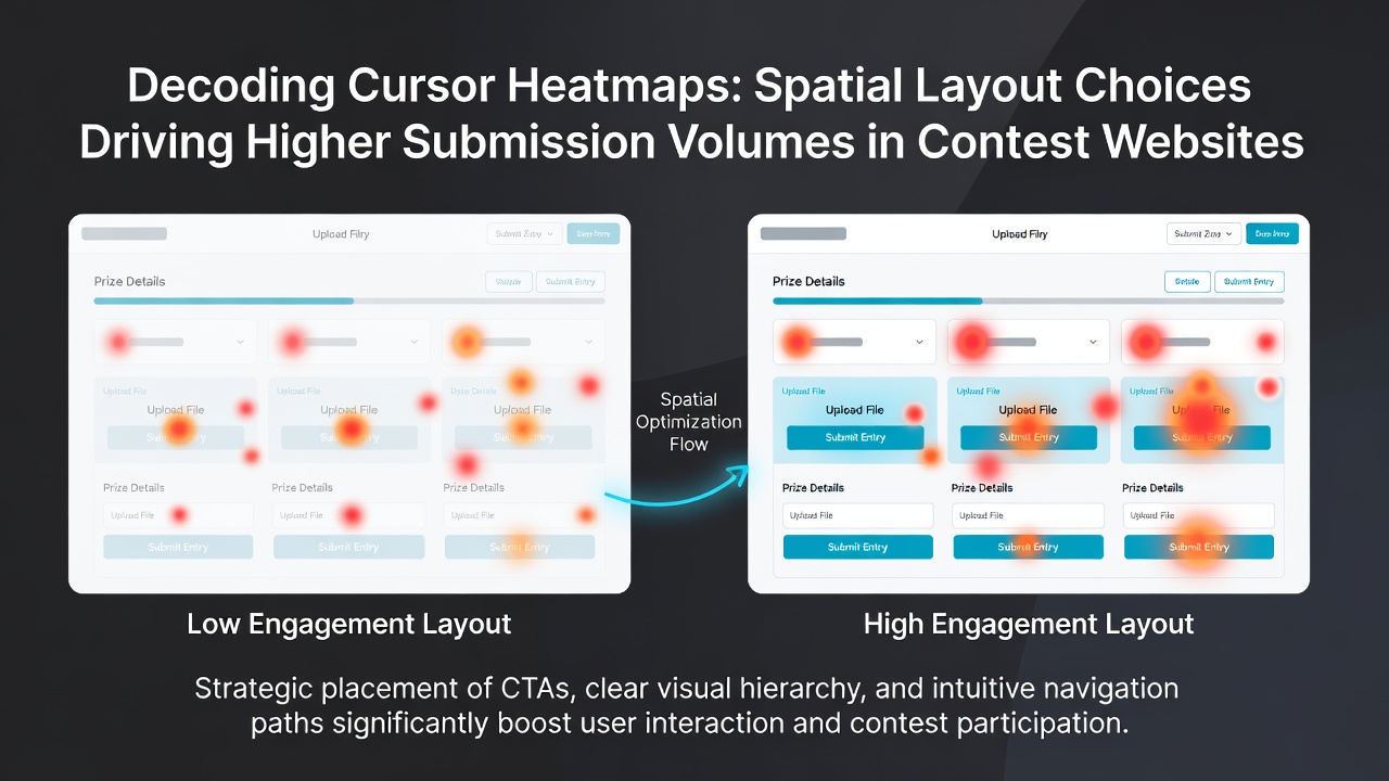
Decoding Cursor Heatmaps: Spatial Layout Choices Driving Higher Submission Volumes in Contest Websites
Cursor heatmaps track mouse movements, hovers, and clicks across contest website interfaces, and data from these tools reveal consistent patterns in how spatial arrangements influence the number of submissions users complete. Platforms that analyze these visualizations adjust button placements, form layouts, and navigation flows based on aggregated interaction data collected through July 2026, when several major contest operators reported refined designs that aligned with observed user paths.
Mapping User Attention Through Heatmap Data
Heatmap analysis begins with the collection of cursor coordinates from thousands of sessions on contest entry pages, where color gradients indicate high-density zones of activity. Researchers at institutions like the University of California, Berkeley have documented that central screen areas near the top third of entry forms attract the majority of initial cursor focus, while peripheral regions receive less engagement unless specific visual cues redirect attention. This distribution helps contest operators identify which layout elements draw sustained interaction versus those that users bypass during the submission process.
Layout choices such as the vertical stacking of required fields versus horizontal arrangements produce measurable differences in completion rates, according to aggregated platform metrics. When fields appear in a single-column format with ample spacing, cursor paths tend to follow a more linear progression from start to finish, whereas multi-column setups often fragment attention across competing sections. Observers note that these patterns hold across desktop and mobile views, although device-specific scaling alters the precise pixel locations of peak activity.
Spatial Elements Linked to Increased Submissions
Contest websites frequently position primary submission buttons below key information sections, and heatmap records show elevated click concentrations in those lower-central zones when sufficient white space separates them from preceding content. Data collected from multi-state digital promotions indicate that buttons placed 200 to 300 pixels below the final input field correlate with higher submission volumes compared to placements that crowd adjacent elements. Additional elements like progress indicators positioned to the left of forms maintain cursor flow without creating visual interruptions that fragment the path toward completion.
Navigation menus located in fixed headers versus sidebar placements also affect how users reach entry sections. Heatmap overlays demonstrate that fixed top navigation preserves cursor momentum toward the main content area, while sidebars can draw stray movements that delay progression to the submission stage. Platforms incorporate these findings by testing variations that prioritize direct routes to entry forms over exploratory side content.
Evidence from Platform Implementations
One study released by the Nielsen Norman Group examined cursor behavior across prize promotion interfaces and found that optimized spacing around call-to-action elements increased submission volumes by directing cursor paths more efficiently through required steps. Those who've examined similar datasets across recurring contest events observe that layouts minimizing horizontal scrolling on standard screen resolutions sustain longer engagement sequences before users reach the final confirmation button.
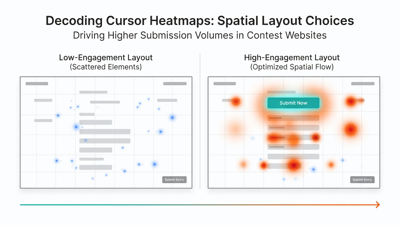
Another set of observations from Canadian digital marketing reports highlights how contest operators in regulated environments adjusted footer placements to avoid cursor diversion away from active entry zones. When footers remained below the fold on initial page loads, heatmap intensity remained concentrated on form elements rather than drifting downward prematurely. These adjustments appear in data logs as steadier progression rates through multi-step submissions.
Integration with Broader User Behavior Metrics
Cursor heatmaps combine with scroll depth measurements and time-on-page statistics to form a fuller picture of layout effectiveness. Australian Competition and Consumer Commission publications on digital promotions note that interfaces maintaining consistent element alignment across devices reduce the likelihood of cursor abandonment mid-form. Contest sites apply these combined insights during periodic redesign cycles, focusing on regions that heatmap data flags as underutilized yet critical for completing entries.
Geographic variations in screen resolutions further shape how spatial decisions translate across user bases. Platforms serving multiple regions test layouts that accommodate both higher-resolution desktop displays common in urban centers and compact mobile views prevalent elsewhere, ensuring cursor paths remain unobstructed regardless of access point.
Conclusion
Cursor heatmap analysis supplies contest website operators with concrete spatial data that informs layout refinements aimed at elevating submission volumes. By aligning form elements, button positions, and navigation structures with documented interaction densities, these platforms sustain measurable increases in completed entries across diverse user cohorts. Ongoing refinements through 2026 continue to draw from the same visualization methods, yielding layouts that guide cursor movement toward higher completion outcomes without altering core contest mechanics.